Rationale
When I picked up machine learning with elixir, there were some goals I had to accomplish like learning how to build and train machine learning models. So I decided to focus on that part first and skipped the data visualization part since that would require me to also get familiar with many more libraries like :kino, :vega_lite. I didn’t want to be overwhelmed as understanding the process of building the models was already enough new knowledge to get familiar with. So I left the data visualization bit to later.
However as I get closer to the phase where I will start architecting my own models, data visualization becomes more of a necessity in my toolbox. I decided to spend time focusing on it and so for this post I’ve put together some of the techniques that I think will be commonly used while building machine learning models.
Project Setup
For this post I will use the iris dataset as an example to explore the various techniques in data visualization. The reason this is a good dataset to work with is it’s very common amongst the machine learning community. This means there are lots of resources around it. Also the dataset is rich enough to provide a deep enough experience when it comes to visualization. It’s a multiclass classification problem where the dataset has 4 features and 3 possible outputs.
Dependencies
Let’s setup our dependencies:
Mix.install([
  {:nx, "~> 0.7"},
  {:exla, "~> 0.7"},
  {:axon, github: "elixir-nx/axon"},
  {:vega_lite, "~> 0.1.6"},
  {:kino_vega_lite, "~> 0.1.10"},
  {:table_rex, "~> 3.1.1"},
  {:explorer, "~> 0.8"},
  {:scholar, "~> 0.3"}
])

Nx.global_default_backend(EXLA.Backend)
Nx.Defn.default_options(compiler: EXLA, client: :cuda)

Application.put_env(:exla, :clients, cuda: [platform: :cuda, memory_fraction: 0.2])
alias VegaLite, as: Vl
require Explorer.DataFrame, as: DFThis is how I simply start all my ML projects in livebook. Feel free to adjust as necessary.
Basic Scatter Plot
Let’s begin by looking at the data we’re working with
iris = Explorer.Datasets.iris()

iris = DF.mutate(iris, [
  species: Explorer.Series.cast(species, :category)
])

cols = ~w(sepal_length sepal_width petal_length petal_width)

normalized_iris =
  DF.mutate(
    iris,
    for col <- across(^cols) do
      {col.name, (col - mean(col)) / variance(col)}
    end
  )
I will be mainly working with the normalized dataset. The data looks like the following:
#Explorer.DataFrame<
  Polars[150 x 5]
  sepal_length f64 [-1.0840606189132322, -1.3757361217598405, -1.66741162460645,
   -1.8132493760297554, -1.2298983703365363, ...]
  sepal_width f64 [2.3722896125315045, -0.28722789030650403, 0.7765791108287005, 0.2446756102610982,
   2.9041931130991068, ...]
  petal_length f64 [-0.7576391687443839, -0.7576391687443839, -0.7897606710936369,
   -0.7255176663951307, -0.7576391687443839, ...]
  petal_width f64 [-1.7147014356654708, -1.7147014356654708, -1.7147014356654708,
   -1.7147014356654708, -1.7147014356654708, ...]
  species category ["Iris-setosa", "Iris-setosa", "Iris-setosa", "Iris-setosa", "Iris-setosa", ...]
>
There are 4 features with 3 possible classes. This makes the problem not as simple as a binary classification. This is a good thing since it will present us with more of a challenge to push us to explore how we can think about visualizing the data.
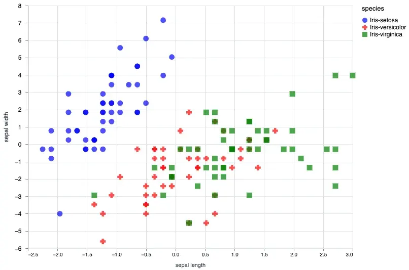
Given that a scatter plot will generally take x0 and x1 since it’s a 2d plot we can first start with a basic plot. In this case we will plot the sepal_length and sepal_width.
sepal_data = normalized_iris[["sepal_length", "sepal_width", "species"]]

Vl.new(width: 640, height: 480)
|> Vl.data_from_values(sepal_data)
|> Vl.mark(:point, size: "120", filled: true)
|> Vl.encode_field(:x, "sepal_length", type: :quantitative, title: "sepal length", scale: %{zero: false})
|> Vl.encode_field(:y, "sepal_width", type: :quantitative, title: "sepal width", scale: %{zero: false})
|> Vl.encode_field(:shape, "species", type: :nominal, scale: %{range: ["circle", "cross", "square"]})
|> Vl.encode_field(:color, "species", type: :nominal, scale: %{range: ["blue", "red", "green"]})
We can also customize the shapes and colors, for all the possible shapes and colors you can check out the vega-lite documentation.
At this point one may be curious and ask whether it’s possible to plot out all the possibilities for the 4 features. If we take 4 * 4 we would know there are actually 16 possibilities. We could plot each of them out one by one, but there is an easier way!
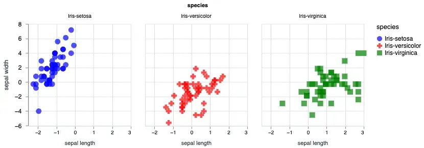
Facetted Scatter Plot
We can also facet our plot based on the species.
sepal_data = normalized_iris[["sepal_length", "sepal_width", "species"]]

Vl.new(width: 640, height: 480)
|> Vl.data_from_values(sepal_data)
|> Vl.facet([field: "species"],
  Vl.new()
  |> Vl.mark(:point, size: "120", filled: true)
  |> Vl.encode_field(:x, "sepal_length", type: :quantitative, title: "sepal length", scale: %{zero: false})
  |> Vl.encode_field(:y, "sepal_width", type: :quantitative, title: "sepal width", scale: %{zero: false})
  |> Vl.encode_field(:shape, "species", type: :nominal, scale: %{range: ["circle", "cross", "square"]})
  |> Vl.encode_field(:color, "species", type: :nominal, scale: %{range: ["blue", "red", "green"]})
)
Using the Vl.facet/3 you can split out the plot based on the species. The output will look like the following:
Multiple Scatter Plot
Let’s plot out all the possible combinations of the features in our dataset.
Vl.new()
|> Vl.data_from_values(normalized_iris)
|> Vl.repeat(
  [
    row: [
      "sepal_length",
      "sepal_width",
      "petal_length",
      "petal_width"
    ],
    column: [
      "petal_width",
      "petal_length",
      "sepal_width",
      "sepal_length"
    ]
  ],
  Vl.new(view: %{fill: "#13477d"})
  |> Vl.mark(:point, filled: true)
  |> Vl.encode_repeat(:x, :column, type: :quantitative, scale: %{zero: false})
  |> Vl.encode_repeat(:y, :row, type: :quantitative, scale: %{zero: false})
  |> Vl.encode_field(:shape, "species", type: :nominal, scale: %{range: ["circle", "cross", "square"]})
  |> Vl.encode_field(:color, "species", type: :nominal, scale: %{range: ["#04c4ca", "#f3ce75", "#e2a099"]})
)
The above code will give you the following output:
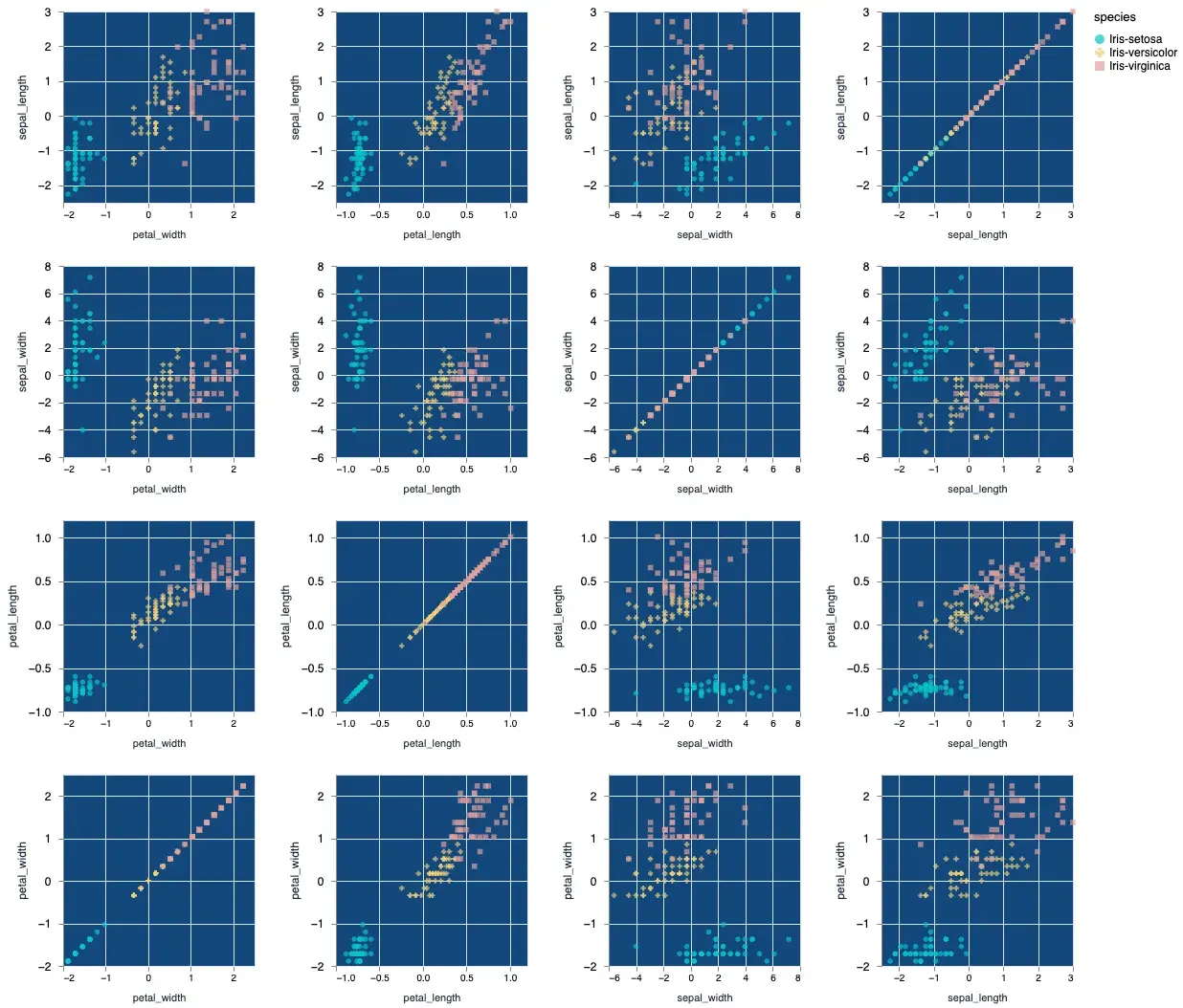
As a bonus I’ve also customized the color output slightly to show you that you can indeed change the colors. Vega lite’s color scheme customization can be pretty deep in and of itself and I will defer you to the official documentation to learn about all the properties.
Training Output Data
When training machine learning models you’ll notice there are a few metrics that are important to track to ensure your model is converging. Things like loss and accuracy are important to understand. We’ll take a look at how we can plot these data. We’ll create a basic model that essentially mimics logistic regression. The focus here is not the model itself but rather the output from the training process.
Let’s setup the training data.
feature_columns = [
  "sepal_length",
  "sepal_width",
  "petal_length",
  "petal_width"
]

x_train = Nx.stack(normalized_iris[feature_columns], axis: -1)

y_train =
  normalized_iris["species"]
  |> Nx.stack(axis: -1)
  |> Nx.equal(Nx.iota({1, 3}, axis: -1))

data_stream = Stream.repeatedly(fn ->
  {x_train, y_train}
end)

model =
  Axon.input("iris_features", shape: {nil, 4})
  |> Axon.dense(3, activation: :softmax)
Notice that our model is very simple. Since this is a logistic regression model it doesn’t event need any hidden layers. Just a simple input and output with a :softmax activation.
Generally to train this model we would need to pass it into a training loop. Let’s focus on the loop:
loss = &Axon.Losses.categorical_cross_entropy(&1, &2, reduction: :mean)

optimizer = Polaris.Optimizers.adam(learning_rate: 0.001)

loop =
  model
  |> Axon.Loop.trainer(loss, optimizer)
  |> Axon.Loop.metric(:accuracy)
I’m passing in a custom loss function. If you want to use the standard default loss function you can also do something like this: model |> Axon.Loop.trainer(:categorical_cross_entropy, optimizer). For now let’s go with the example above.
By default the loop will simply output the trained state of the model. The trained state simply gives us the weights and biases we can use for making predictions. In our case though we want to peel back the cover and understand what’s going on so what we’ll need to do is tweak the output a bit.
We will tweak the output of the loop:
output = fn state ->
  %{trained_state: state.step_state.model_state, metadata: state.handler_metadata}
end

loop = %{loop | output_transform: output}
We’ve replaced the default output_transform with our own map. This will give us the :trained_state and the :metadata. By default the state parameter is a struct that looks like the following:
%Axon.Loop.State{
  epoch: integer(),
  max_epoch: integer(),
  iteration: integer(),
  max_iteration: integer(),
  metrics: map(string(), container()),
  times: map(integer(), integer()),
  step_state: container(),
  handler_metadata: container()
}
In our case we will target to update the handler_metadata field. This is just a map and we can updated it with our own data.
Collecting the Loss History
Since we want to plot out the loss we will need to collect the loss_history. Fortunately Axon allows us to do this with Axon.Loop.handle_event/4. There is a list of events we can hook into:
events = [
  :started,             # After loop state initialization
  :epoch_started,       # On epoch start
  :iteration_started,   # On iteration start
  :iteration_completed, # On iteration complete
  :epoch_completed,     # On epoch complete
  :epoch_halted,        # On epoch halt, if early halted
]
In our case the :epoch_completed will be the perfect place to collect the loss of a given epoch. We will need to create a custom collector function and pass it into the handle_event:
metadata_collector = fn state ->
  # Things we want to collect
  epoch = state.epoch
  loss = Nx.to_number(state.step_state.loss)
  accuracy = Nx.to_number(state.metrics["accuracy"])

  # retrieve the data from the metadata if non exist fallback to []
  # on 0 loop it will fallback and start with []
  # on 1 loop it will load the existing
  loss_history = state.handler_metadata[:loss_history] || []
  accuracy_history = state.handler_metadata[:accuracy_history] || []
  epoch_index = state.handler_metadata[:epoch_index] || []

  # here we update the :handler_metadata with our own map
  state = Map.put(state, :handler_metadata, %{
    loss_history: loss_history ++ [loss],
    accuracy_history: accuracy_history ++ [accuracy],
    epoch_index: epoch_index ++ [epoch]
  })

  # return the state
  {:continue, state}
end

loop =
  loop # from the previous block
  |> Axon.Loop.handle_event(:epoch_completed, metadata_collector)
Now that we’ve got everything we need let’s run the training loop. Since our data stream is just an endless stream of training data, we’ll need to se the iterations as well as the epochs.
initial_state = Axon.ModelState.new(%{})

output_state =
  Axon.Loop.run(loop, data_stream, initial_state, iterations: 300, epochs: 20)
Plotting the Loss and Accuracy
If we take a look inside the output_state we should see 2 parameters the trained_state of the model and the metadata.
%{
  metadata: %{
    loss_history: [0.5978554487228394, 0.5133825540542603, 0.4624224603176117,
     0.42432668805122375, 0.39334431290626526, 0.3671410083770752,
     0.3445121943950653, 0.32471662759780884, 0.30724000930786133,
     0.2916971743106842, 0.27778682112693787, 0.26526767015457153,
     0.25394338369369507, 0.2436511218547821, 0.2342575192451477,
     0.22565050423145294, 0.21773554384708405, 0.21043287217617035,
     0.20367415249347687, 0.19740144908428192],
    accuracy_history: [0.6521788239479065, 0.7612004280090332,
     0.8443354368209839, 0.8993551135063171, 0.9269324541091919,
     0.9491595029830933, 0.9572917222976685, 0.9600027799606323,
     0.9662654995918274, 0.9666659832000732, 0.9715091586112976,
     0.9733316898345947, 0.9733316898345947, 0.9733316898345947,
     0.9733316898345947, 0.9733316898345947, 0.9733316898345947,
     0.9733316898345947, 0.9733316898345947, 0.9733316898345947],
    epoch_index: [0, 1, 2, 3, 4, 5, 6, 7, 8, 9, 10, 11, 12, 13, 14, 15, 16, 17,
     18, 19]
  },
  trained_state: #Axon.ModelState<
    Parameters: 15 (60 B)
    Trainable Parameters: 15 (60 B)
    Trainable State: 0, (0 B)
  >
}
Perfect! we now have everything we need to plot this data.
Vl.new(width: 640, height: 480)
|> Vl.data_from_values(output_state.metadata)
|> Vl.mark(:line, color: "red", interpolate: "natural")
|> Vl.encode_field(:x, "epoch_index", type: :quantitative, title: "Epoch")
|> Vl.encode_field(:y, "loss_history", type: :quantitative, title: "Loss", scale: %{zero: false})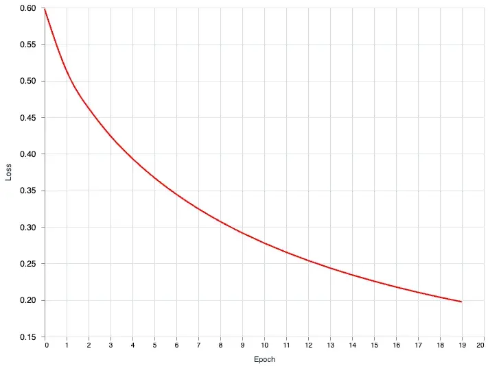
The interpolate option is customizable. You can customize it based on these values: basis, cardinal, catmull-rom, linear (default), monotone, natural, step, step-after, step-before. I recommend checking out the official documentation for more. The interpolate just allows you to smooth out the line curve. If you don’t want any smoothing simply set it to linear or just remove the option.
We can also plot the accuracy on the same chart. Let’s do a multi layer plot. We’ll split the plot into 2 yaers the loss_layer and the accuracy_layer.
loss_layer =
  Vl.new()
  |> Vl.mark(:line, color: "red", interpolate: "natural")
  |> Vl.encode_field(:x, "epoch_index", type: :quantitative, title: "Epoch")
  |> Vl.encode_field(:y, "loss_history", type: :quantitative, title: "Loss", scale: %{zero: false})

accuracy_layer =
  Vl.new()
  |> Vl.mark(:line, interpolate: "natural")
  |> Vl.encode_field(:x, "epoch_index", type: :quantitative, title: "Epoch")
  |> Vl.encode_field(:y, "accuracy_history", type: :quantitative, title: "Accuracy", scale: %{zero: false})

Vl.new(width: 640, height: 480)
|> Vl.data_from_values(output_state.metadata)
|> Vl.layers([loss_layer, accuracy_layer])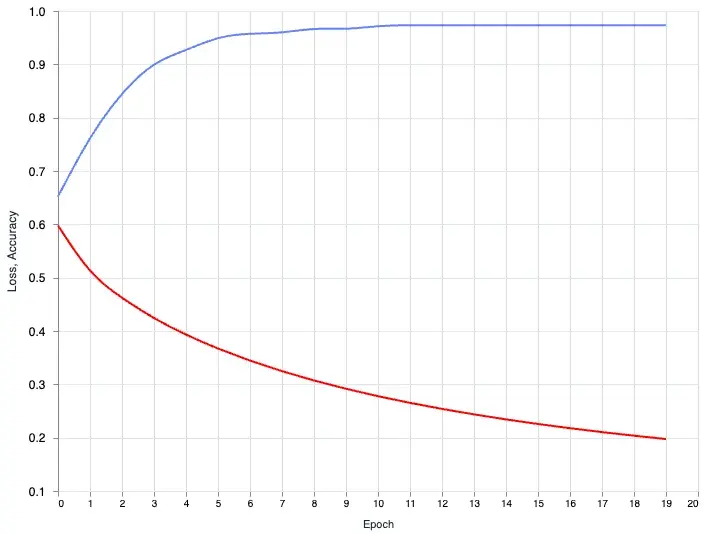
The loss is going down and the accuracy is going up. With a single glance we know our model training is doing it’s job. The wonderful thing about this is, when you have a more complex model and you want to tweak the hyperparameters and see how it changes the output. You can now do this with ease.
Currently we are training a very simple model. The training time is short so it makes sense to wait for the training to be completed and then plot the output. What if you are training a large model with large datasets, this can be a time consuming process and waiting to see the output can be very long. You might want to be able to quickly see how your model is doing during the training process. We can do this too!
Plotting the Training data in Real-Time
In this next part we will combine what we learned in the previous section of turning the metadata_collector function into a metadata_plot function. Let’s begin by creating an empty chart.
# initialize the chart
chart =
  Vl.new(width: 640, height: 480)
  |> Vl.mark(:line, color: "red", interpolate: "natural")
  |> Vl.encode_field(:x, "epoch", type: :quantitative, title: "Epoch")
  |> Vl.encode_field(:y, "loss", type: :quantitative, title: "Loss", scale: %{zero: false})
  |> Kino.VegaLite.new()

Kino.render(chart)

metadata_plotter = fn state ->
  Kino.VegaLite.push(chart, %{
    "epoch" => state.epoch,
    "loss" => Nx.to_number(state.step_state.loss)
  })

  {:continue, state}
end
Notice we’re not passing in any data into the chart, we’re simply initializing it. We then create a new metadata_plotter function. You’ll see we’re pushing new data point onto the chart. For this example we’re only going to plot the loss history, but you can also pass in the accuracy data if you wish.
Let’s tweak our loop and run it:
initial_state = Axon.ModelState.new(%{})

loop =
  loop
  |> Axon.Loop.handle_event(:epoch_completed, metadata_plotter)

output_state_2 =
  Axon.Loop.run(loop, data_stream, initial_state, iterations: 300, epochs: 20)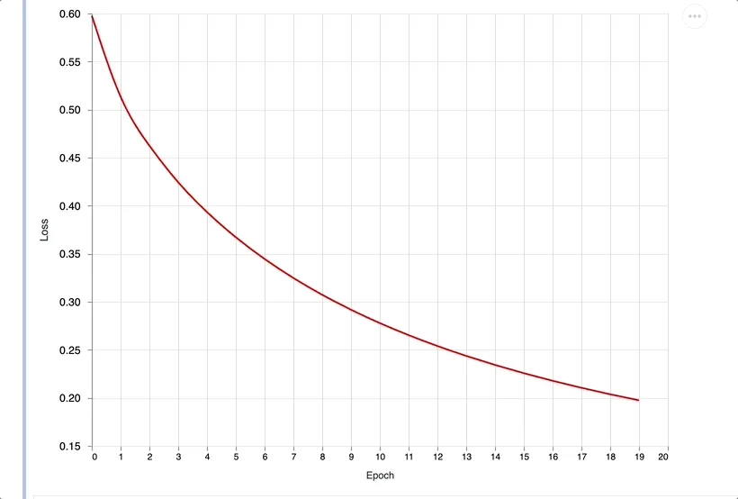
You should see the data being plotted in real-time. For long running training task being able to see the progress output in real-time can be very useful.
Axon’s Native Plotter
Axon also has a built in plotter if you just want the loss / accuracy curve this is probably the best way to go. It plots every step, which means the output is even more fine grained than plotting after every epoch. However I still think it’s good to know how it works under the hood incase you want to monitor metrics or customize the plot like for example plotting the accuracy and loss in a single chart. To use the Axon plotter you can try something like this:
initial_state = Axon.ModelState.new(%{})

plot =
  Vl.new(width: 640, height: 480)
  |> Vl.mark(:line)
  |> Vl.encode_field(:x, "step", type: :quantitative)
  |> Vl.encode_field(:y, "accuracy", type: :quantitative) # swap to loss for the loss curve
  |> Kino.VegaLite.new()
  |> Kino.render()

loop =
  model
  |> Axon.Loop.trainer(loss, optimizer)
  |> Axon.Loop.metric(:accuracy)
  |> Axon.Loop.kino_vega_lite_plot(plot, "accuracy") # swap to loss if you want the loss curve
  |> Axon.Loop.run(data_stream, initial_state, iterations: 500, epochs: 10)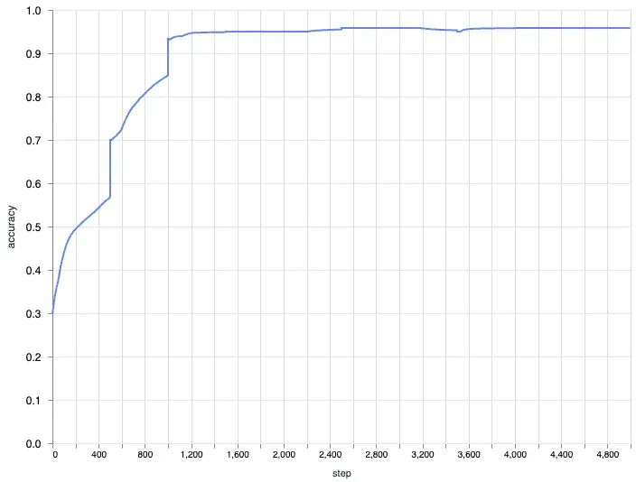
Closing Thoughts
In this post we looked at scatter plots for the dataset both with single feature pair and a combination of all the feature pairs. We also looked at plotting out the metrics of the model training process. We dug deeper into the inner workings of Axon to figure out how we can modify the output and also plot the loss and accuracy of the training process.
There is a lot more to explore when it comes to the data tooling in Elixir’s machine learning ecosystem. For example there is a very nice library called :tucan which is a wrapper ontop of :vega_lite and provides a higher level of abstraction to make it easier to visualize data.
We still haven’t gone into deeper model inspection metrics like evalutating our model against a test set and comparing the accuracy. Imagine we were not sure which parameters would yield the best result and we wanted to create multiple models and compare the results between them. There are also metrics like recall and precision and plotting out the confusion matrix. As I delve deeper into the ecosystem I’ll be sure to share more.
If you like this post and would like to learn more you can support me by buying me coffee.

Also checkout my DevOps product. I’ve helped businesses setup deployment pipelines, cut cloud and operational spending with best practices with very quick turnaround. If you’re interested in learning more you can book a call with me.